
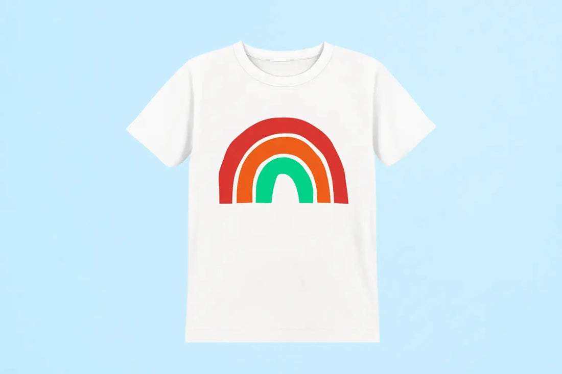
DTF printing is super popular with small brands everywhere because it makes bright, colorful prints on a plethora of materials. But things don't always go as planned. Sometimes, the design on your shirt isn't quite what you saw on your computer screen. You may detect hues that are too dark, too light, or just incorrect. You may also notice that colors seem muted. DTF color mismatch helps address these problems because DTF print looks different than design for almost everyone at some point, and it can be frustrating.
The good news: you don't have to be a color scientist to repair it. When DTF colors don’t match the screen, it usually means: incorrect color profiles, faulty calibration, or environmental conditions. Often, repairing them involves catching small things that make a big impact. Six easy actions let us help your prints match what you see on screen.
DTF Color Mismatch Fixes in Six Simple Steps
Step 1: Use the Right Color Profile
Color begins before you even press "print." For DTF color accuracy, the right ICC profile is essential. This small file instructs your printer how to turn screen colors into genuine ink on fabric. Blues can turn purple without it, reds can look lifeless, and everything can seem strange.
Demand an ICC profile specifically created for your printer, inks, and film pairing from your ink or film provider. Install it in both your design tools and RIP program; always create in RGB unless your workflow calls for CMYK. Soft Proof your design using the ICC profile before printing to avoid surprises, and follow the best color settings for DTF printing early on.
Step 2: Calibrate Your Monitor
Even if your printer is set up perfectly, your prints won't look right if your monitor's colors are off (you may still notice screen vs print color difference). Calibrating your monitor fixes this, so what you see is what you get. Use a tool like XRite or Spyder to calibrate. Set your monitor to a 6500K temperature and about 120 cd/m² brightness. If you print a lot, recalibrate every month.
Step 3: Review Your RIP Settings
Your Raster Image Processor (RIP) converts your design into printer language. Small errors here cause major DTF transfer color problems. Confirm your RIP uses the correct ICC profile, current firmware, and right media settings. Double-check ink limits, resolution, and drying time, and keep your designs in RGB unless your workflow needs CMYK. Even missing an update after switching inks or film can throw colors off. Keeping a quick print log helps. Good DTF printer color management here means fewer surprises once ink hits fabric.
Step 4: Keep Humidity and Temperature Under Observation
Color, curing, and ink flow depend on temperature and humidity. High humidity keeps ink wet too long, causing darker or fuzzy prints, while low humidity dries ink too fast and makes colors fade.
Aim for about 40–60% humidity and 20–25°C (68–77°F). Use a hygrometer and thermometer daily. Store films, powders, and inks sealed, away from the sun or heat. By adjusting colors in DTF designs in a controlled environment, you can have a predictable outcome.
Step 5: Maintain Your Printer
A well-maintained printer keeps colors sharp and true. Do daily nozzle checks to catch clogs, clean the printhead and parts often, and gently shake inks to keep pigments even. Always use inks before expiration dates. When you see lines, banding, or fading, run alignment tests to correct them. Staying on top of this keeps your ICC profiles and RIP effective, avoids random color issues, and supports DTF color accuracy. Think of it as daily car care; skip it, and you risk big problems and wasted prints.
Step 6: Test, Adjust, and Document
Every DTF setup prints a little differently. Print small test swatches before big jobs. Compare prints to your calibrated screen, tweak designs (like richer blues or stronger reds), and track which changes work. Write down humidity, temperature, film type, powder brand, and settings when prints come out perfect. Later, check your notes if the season changes or you switch brands. Log each instance when a DTF print looks different the design, and use DTF printer color management techniques to avoid those errors.
Why Choose Picasso DTF for DTF Prints
Picasso DTF helps you get pro-level color without guesswork. Our specialist support and ICC profiles guide you, and our premium films and powders stay stable under changing conditions. For shops or hobbyists, Picasso DTF makes DTF color correction easier so your prints keep customers coming back. Want to test our print quality? Try our DTF Sample Pack and start printing without any DTF color mismatch like the big brands to generate the ROI you have always dreamed of.
Final Thoughts
In short, how to fix DTF color issues? It's simple, focus on profiles, calibration, RIP setup, environment control, printer maintenance, and steady testing. To keep your prints looking sharp and pro, and to save yourself time and headaches, try these daily habits. Good color comes from doing the same things over and over.
With Picasso DTF, stop worrying about being perfect. Instead, set up a system that gives you good results all the time.
With Picasso DTF, it is less about chasing perfection and more about creating a system that delivers solid results every time. So, for absolute color correction, choose a supplier wisely because only a reliable and reputable supplier can give you the color quality you expect from your dTF prints.