
Picasso DTF Color Chart
Couldn't load pickup availability
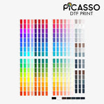
Discover the perfect colors for your next project with the Picasso DTF Color Chart! Whether you're a designer, printer, or creative enthusiast, this handy chart takes the guesswork out of color matching for Direct to Film (DTF) printing. It’s your go-to tool to see exactly how each shade will appear on your prints, vibrant, accurate, and ready to inspire.
The chart showcases a full spectrum of colors available through Picasso’s DTF inks, helping you choose with confidence and precision. No more surprises when your designs come to life, just consistent, beautiful results every time.
Compact and easy to reference, this color chart is perfect for planning your artwork, mixing palettes, or showing clients true-to-life color options. Elevate your printing game and make every project a colorful success with Picasso’s trusted DTF Color Chart.
Ready to bring your ideas to life with flawless color? Grab your chart today!
Want to match colors precisely? Use our DTF Sample Pack alongside the color chart for flawless results.
Frequently Asked Questions
It's a printed reference sheet that shows you exactly how our DTF inks look on film, not on your screen. Monitors lie. And this chart doesn't. This works well because you can see the real vibrancy, opacity, and finish before you print, so you're not guessing on color.
Because RGB on your monitor doesn't equal CMYK on our printers. That bright neon you love will shift, every time. And the chart proves it. You get 100+ real printed swatches labeled with values, so you pick what actually prints instead of hoping your hex looks right.
The full spectrum we actually print: deep reds, royal blues, forest greens, soft pastels, hot neons, skin tones, true blacks and grays. Each swatch is labeled, so you match your art directly. No vague 'light blue' talk. You point to the exact swatch you want.
It kills the 'that's not the blue I wanted' conversation. Instead of describing a color, you show the client the chart. They pick, you print. And you have proof. This works well because you avoid costly reprints, refunds, and that awkward text that your blue looks purple.
It's a real printed DTF transfer, not a PDF. That's the whole point. You see true ink density, white under-base, and how it feels on film. A digital file can't show that. And when you hold it next to your shirt, you know exactly what you'll get.
Keep it on your desk while you design. Pick your palette from the chart first, then plug those CMYK values into your file before you upload. And if you're torn between two reds, the chart shows which one actually pops on black versus white shirts.
A little, yeah. But our white under-base keeps colors vibrant on both. The chart shows you how that base works, so you don't get a washed-out print on black tees. So test it. Press your sample on light and dark fabric and you'll see the difference instantly.
Yes. We print this chart on the exact same production printers, inks, and powder we use for your orders. It's not old stock. So what you're holding is current. If we ever switch ink systems, we reprint the chart; otherwise it's not accurate enough.
Any designer, small shop owner, or creator tired of color surprises. If you sell custom shirts, this pays for itself in one avoided reprint. And it makes you look legit. You pull out a chart, clients trust you know color, not just Photoshop and guesswork.
It's compact, designed to sit on your workbench without hogging space. About the size of a standard gang sheet reference. Store it flat, away from heat and direct sun like any DTF transfer. Grab it when you need to match, tuck it away quickly after.